Welcome to the second installment of Digital Marketing Summer School (DMSS)! This blog post and my last post on landing pages are meant to focus on your education. Specifically, your Digital Marketing Education. I’m picking three Digital Marketing Terms to demystify.
DMSS Lesson 2: What Is A “Call To Action”?
A good webpage makes it blindingly obvious to your visitor what you want them to do. The thing that prompts your visitor to do that thing is called the “Call To Action”. It’s usually a clickable button.
Here’s the definition of a Call To Action (CTA) from the experts over at LeadPages:
Call to Action (CTA): The part of a landing page (or email, or other marketing asset) that asks people to do something, such as opting into an email list or making a purchase. A CTA is often a clickable button.
Ok, easy stuff. Here are some things that make a call to action effective:
Contrast
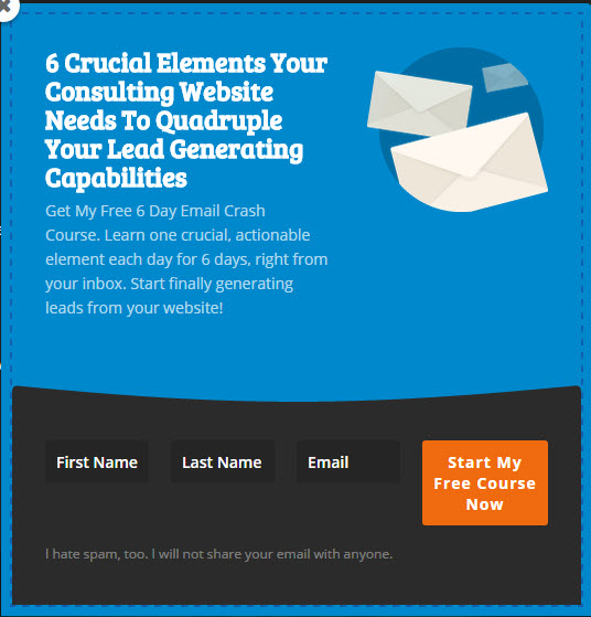
You want your Call To Action to pop on your page. A contrasting colour usually does the trick. For the designers in us, this can be a bit unnerving. We tend to want to follow a consistent color scheme across all your marketing pieces, and orange or neon green don’t always fit into that! Striking a balance between design and purpose here can be a challenge, but a good digital marketer will work it out.
Finishes the Statement “I Want To…”
 A good CTA will finish this statement: “I Want To…”
- Get A Free Quote
- Start My Free Course Now
- Download This Whitepaper Now
- Start Remote Support
- Book Storage
Here’s an example of the Call To Action I have on my website. As you can see, I practice what I preach. The orange button jumps out, and the “Start My Free Course Now” answers the “I Want To” question. And by the way, I’d love it if you signed up! Click here or on the button, to get the email course.
So that wraps up Digital Marketing Summer School, Lesson Two. I hope you are having a great summer! Get in touch if you have any questions or need help with your digital marketing.